



Choosing a Lighted Sign for a Shop: legibility, lighting and dimensions
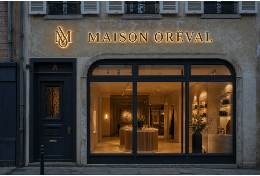
A well-designed lighted sign attracts attention, clarifies the offer and enhances the shop’s image. Between the choice of lettering, the type of lighting, the size and the installation, several decisions affect legibility and longevity. This article provides concrete advice to design a harmonious and functional sign, taking as inspiration an elegant façade like MAISON ORÉVAL with full lettering and a backlit brass monogram, patina and natural reflections at twilight.
Legibility: fonts, spacing and contrast
Legibility is the priority. Favor simple, clean fonts: sans-serif (linear) typefaces provide clarity at a distance; very thin or highly decorative fonts lose readability as distance increases. Work on letter spacing to prevent adjacent shapes from merging. Contrast between letter color and background should be strong both day and night: dark letters on a light background or vice versa eases reading. For an elegant result (as in the MAISON ORÉVAL example), understated lettering paired with a discreet monogram works well: the monogram can be smaller and placed at eye level so it does not compete with the main name. Always test legibility at distance and in low light before approval.
Light: type of lighting and atmosphere
Choosing the right lighting determines visual impact. Backlit lighting creates a halo around letters, offering a soft, high-end look, particularly suited to noble materials such as aged brass. Face-lit lighting makes letters more conspicuous and works well for commercial messages. Consider color temperature: warm light flatters patinated materials and creates a welcoming atmosphere; neutral or cool light enhances legibility but can feel more commercial. Also think about uniformity: LED modules must be positioned to avoid dark bands or hot spots. Finally, take the environment into account: public lighting, neighboring shop windows and local regulations (do not promise compliance, check with the competent authorities).
Materials: aesthetics, durability and maintenance
Material choice influences appearance and upkeep. Brass (or plated brass) brings a warm patina and a premium look, ideal for a characterful sign. Aluminum is lightweight and weather-resistant, often used for cut letter bodies. Transparent or opal acrylic serves as a diffuser for uniform illumination. PVC and aluminum composite are economical but less noble visually. Consider aging: some materials accept and enhance patina, others require regular maintenance. Choose finishes and anti-corrosion treatments suited to the local climate. For an artisanal look like the cited example, combine polished or patinated brass for the monogram with discreet relief letters, protecting surfaces from splashes and moisture.
Dimensions and placement: adapt to the façade and the viewer
Sign size should be proportionate to the façade and the traffic type: a busy street does not require the same letter height as a pedestrian area. Think about reading distance: the main name must be legible from the primary approach axis. Place the sign at a height that avoids obstructions (balconies, cornices, cables) and that relates well to the shop window. If you combine lettering and a monogram, establish hierarchy: the name in more visible letters, the monogram as a secondary marker. Respect architectural constraints and plan fixings behind insulation or stone without compromising the façade’s watertightness.
Preparation for installation, fixings and maintenance
Proper façade preparation is essential: check the condition of the support, clean and, if necessary, restore the surface before any fixing. Use fixing systems suited to the wall material (anchors for masonry, brackets for cladding) and plan sealing joints to avoid water ingress. Integrate drainage for boxes so water does not stagnate. Plan access for maintenance: intervention points to replace LED modules, clearances to remove elements if needed. For any electrical connection, involve a qualified professional: we recommend entrusting commissioning to a certified electrician, without providing electrical procedures yourself.
Additional technology: NFC and connectivity
Integrating NFC or a connected element can provide services (product information, map, promotions). Assess actual usage: does the target audience habitually use NFC, and does footfall justify the investment? Consider ease of use, data security and the need for a network if you plan dynamic content. Test under real conditions and provide clear signage inviting use. Our candid view: NFC is relevant for enriched experiences but is not automatically useful for all shops; evaluate the real benefit before integration.
Designing a lighted sign requires balancing legibility, lighting, materials and installation. Work on the visual hierarchy (main name vs. markers), choose lighting appropriate to the desired atmosphere and prepare the mounting carefully to ensure durability and ease of maintenance. Relying on legibility tests and a validated BAT reduces production surprises. The usual lead time after BAT validation is 6 to 10 working days depending on the project; confirm in the quote. For any electrical connection, use a qualified electrician. If you are considering connected options (NFC), objectively assess their usefulness for your clientele before investing.