



Creating a wooden wall logo for the reception: material, finesse and mounting
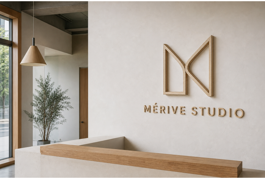
Taking a place in the reception of a design studio like MÉRIVE STUDIO implies that the wall logo must be both readable, coherent with the interior and durable. Imagining an abstract M emblem and letters cut from birch plywood, with the edge visible and placed on an off-white plaster finish under soft lighting, this article gives practical advice on material choice, letter fineness, wall preparation and suitable fixing methods for a reception space.
Choice of materials: birch plywood and alternatives
Birch plywood (birch plywood) is a common choice for a high-end wall logo: attractive grain, light edge and dimensional stability. For a natural look with the edge visible, favour veneers with regular plies and a plywood that can be sanded cleanly. Also consider: - A structural-grade plywood for precise cutting by laser or CNC. - Alternatives such as MDF veneered with wood if you want a very smooth surface before finishing. - Solid woods for a more raw look, but beware of weight and hygrometric stability. Think about surface treatment: natural oil or matte varnish protect the wood while preserving the tactile aspect. Avoid very glossy finishes in a reception that seeks warmth and discretion.
Letter fineness and legibility: shapes, thickness and spacing
Legibility determines the logo’s impact. To keep letter fineness without compromising robustness: - Avoid strokes that are too thin, which risk breaking during cutting or installation; adapt the minimum thickness to the workshop’s cutting capabilities. - Prefer simple counterforms (without excessive flourishes) for small letters: high-contrast thick-and-thin strokes lose detail at small scale. - Consider contrast: on an off-white wall, a light wood with visible edge works well if the cast shadow is sufficient. If the lighting is flat, consider a slight tint or a satin varnish to increase visual contrast. - Spacing: leave space between the emblem (the abstract M) and the lettering so each element can breathe. In a reception where viewers look from close distance, letter height should match the main viewing point (person standing at reception or seated while waiting).
Preparation of the wall and lettering before installation
A successful installation starts with a prepared wall: - Check the flatness of the area. Off-white finishes can mask minor defects, but significant irregularities require local leveling. - Clean the surface and apply, if necessary, a compatible primer (ask the wall product manufacturer) to avoid variations in adhesion. - Make a scale mock-up (BAT): a paper or cardboard template temporarily affixed allows assessment of legibility and placement relative to furniture lines and natural light. - Check the finishing of the wooden pieces: sanding of the edges, deburring and applying the final finish before installation can simplify handling and avoid on-site touch-ups.
Fixing methods: mechanical, invisible or mixed
The choice of fixing depends on weight, thickness and aesthetics. Common options: - Invisible mechanical fixing: anchors engaged with threaded rods or studs glued to the back of the letters (rod system) provide a clean hold and allow a slight offset to play with shadows. - French cleat system for heavier elements or backing panels: practical for horizontal adjustments in the workshop and final installation on site. - Structural-bond adhesives: for light pieces and smooth walls, structural-bond adhesives can be sufficient, but their use depends on wall type and must be validated by testing. - Mixed fixing: anchors + glue for thin pieces to avoid vibration. Important points: pre-drill with a template, protect the edges when drilling and plan covers for fixings if they are visible. If the sign includes integrated lighting, entrust the electrical connection to a qualified person; do not perform electrical work yourself. Do not promise electrical performance — that is the role of the electrician and the technical quote.
Finishes, maintenance and technical options (NFC, end grain)
For a birch logo with the edge visible: - Edge finish: fine sanding then oil or matte varnish to stabilize and bring out the edge. - End grain visible: the appearance of the cut must be neat; slightly chamfering the edges prevents chipping. - Maintenance: gentle cleaning with a damp microfibre sponge and occasional re‑application of oil if needed. - NFC and interactivity: embedding an NFC chip behind a logo can provide functions (studio profile, portfolio). Advantages: discreet, modern interaction. Disadvantages: limited range due to wood and adhesive, tag maintenance, and the need to inform visitors. Give an honest opinion to decision-makers: it is useful for targeted use cases but not essential to the visual outcome. No commercial push to favour this option; evaluate its relevance according to the expected use.
Making a wooden wall logo for the reception requires trade-offs between aesthetics, legibility and technical constraints. Starting from a well-finished birch plywood, adapting letter fineness to the workshop’s cutting capability, preparing the wall correctly and choosing an appropriate fixing method will yield a professional, durable result. For fabrication, plan for the validation of a BAT and a usual lead time of 6 to 10 working days after that approval; this timing should be confirmed in the quote. If an electrical connection is required, hire a qualified person. The name MÉRIVE STUDIO has been used here as a hypothetical example to illustrate aesthetic and technical choices.